S Is for Style: The Schumacher Book of Decoration; Dara Caponigro
Design Master
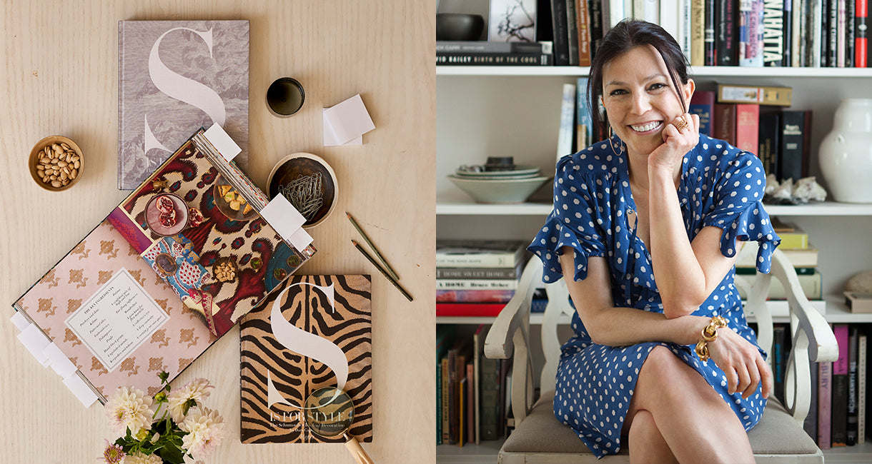
With the release of her new book, S is for Style, Schumacher Creative Director Dara Caponigro lets us in on a few secrets to styling a life.
Design world star Dara Caponigro’s experience is a veritable OMG arc of career highlights: she’s been on the masthead at all the shelter magazines we fervently flip through for inspiration (Elle Decor, House Beautiful, the late, great Domino, and Veranda) and is currently Creative Director at Schumacher, the storied textile and wallcoverings house that decorators around the globe turn to for sumptuous, colorful patterns and textures.
This month, Caponigro and Shumacher will release S is For Style, a tome devoted to the works of countless designers and rooms that span styles from classic to contemporary. To celebrate the release, we sent over a few quick-answer design (and beauty!) Q’s and asked her to share some of her favorite rooms from the book. If you’ve been fighting the urge to make some decor changes in your own home, there’s major inspo waiting below.
Wallpaper: statement wall or every wall Every wall unless you live in a modern loft
Paint (or fabric?): flat or textured Textured wallcovering. It’s one step above paint and gives such a pulled together look.
Master bedroom: neutral or bright Neutral so it’s a tranquil oasis
A room to delight and surprise with Your closets! I’ve wallpapered the inside of every one of mine and they’re a treasure to behold every time I open the door.
Antiques: on display or stored away Definitely on display
Following the latest trends in design: do or don’t Don’t
Color tones: warm or cool A mix of both
Design: minimalist or collector I’m more of a minimalist but I’m definitely a collector, too. For me, it’s about curation.
On the walls: personal photographs or inspiring art Inspiring art unless it’s a bedroom hallway
Natural light, candlelight or overhead light Natural light
Makeup: on the counter or in a drawer A little of both
Lipstick: bold or nude Nude
My skincare must have is Chantecaille Pure Rosewater spray: it makes you feel human
I never go out without sunscreen, and the Ultra Sun Protection SPF45 Primer is a great 2-in-1 product that protects and improves the way my skin looks.
When I start designing a room, I start with What I already have
My favorite magazine to go to for inspiration is WSJ
I would move into Bill Blass’ country house tomorrow if I could
The artist that inspires me the most is Lucien Freud
I go to Brussels for the best antiques
For furniture, invest in Georgian antiques.
After a long day on a photo shoot…a quick application of the Jasmine and Lily Healing Mask soothes my skin—and I wake up feeling refreshed.
A vignette is never complete without Something to throw it off.
My favorite finishing touch in a room is always Books.
"My skincare must have is Chantecaille Pure Rosewater spray: it makes you feel human."
Mixing + Matching at Home
One of Dara’s signature style tricks is masterful mixing and matching—she can make any print or pattern work together, ditto for pieces from different style schools or eras. Some of her favorite pages in S is for Style point out just how beautiful mixing things up can be. Here, she speaks to the vibe each room emanates and why these particular rooms really sing.
Photographer: Max Kim-Bee
THE STYLE: Laid Back
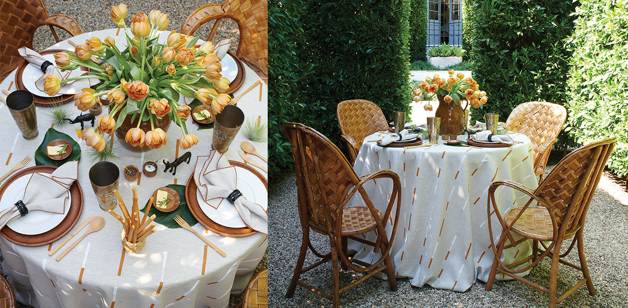
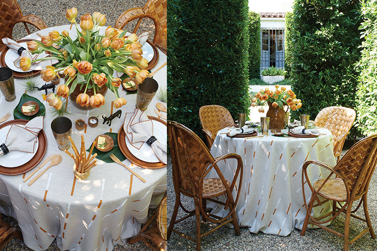
At his own home in Montecito, California, interior designer Richard Hallberg set the scene for an intimate lunch within an outdoor dining room created by soaring boxwood hedges. Richard is a master of the mix and a lover of interesting objects—the neutral scene comes to life when you look closely at the sculptural pieces on his table and zero in on how many materials are actually used: teak, terracotta, bamboo, ceramic, iron, straw, Moroccan silver and brass, all atop a tablecloth in a Schumacher linen called Overlapping Dashes, by Caroline Z Hurley. It’s a great example of how a point of view and a color scheme can unite myriad objects
Photographer: Francesco Lagnese
THE STYLE: Happy Modern
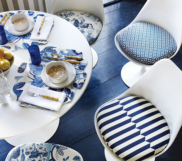
Another great example of a scene unified by color is this table setting in blue and white. The seat cushions are all different and the fabrics run the style gamut from modern to preppy to traditional. It’s a fun twist on a matching table and chairs and works because the “mixing” part of the recipe is contained solely to the seat cushions. Fabrics are Persian Lancers, Serendipity, Maxwell and Landsdale Bouquet.
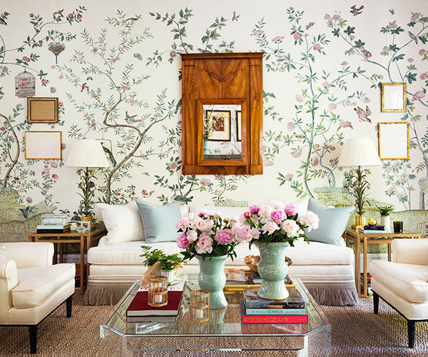
Photographer: Mali Azima
THE STYLE: Ladylike
Interior designer Beth Webb gave this show house room a decidedly feminine bent with our floral Xanadu Landscape wallpaper by Iksel Decorative Arts. But, to me, it’s her addition of surprisingly strong, handsome elements that makes this room: the sharp metal end tables, a bold Lucite coffee table, and an antique burled mirror keep things interesting and grounded so it doesn’t feel overly sweet.
